One logo for every ground.
Hondo. The main icon: tablet in Menta, K in Hondo. The word goes in Crema. Tablet against ground, 8.3 : 1.
A K that is a V, and also a leaf.
Inside the tablet there is one drawing. Everything else comes out of it.
Nothing is left to chance.
Colour comes from a ladder of lightness, contrast is counted in tones and every shape comes from one drawing.
The mark comes from a letter that does not want to be spelled.
Grid.
It all starts from a square of side x cut into 21 modules. The K takes 13 of them, with 4 to spare on every side: 13 and 21, two Fibonacci numbers, the golden ratio.
Colour
Menta on Hondo
Contrast is counted in tones.
76 − 22548.3 : 1
- 36Graphics, icons, the tablet of the logoYes
- 48Reading text at any sizeYes
- 54Small text, figures, long readingYes
Each tone shows its distance to this ground. Under 36 nothing reads on it: press one of those and it becomes the ground.
Three families with the same logic: each has its dark ground, its principal, its light and its soft. The waters are the brand and monitoring, the earths are Seed, for conservation, and the greens are the calculator. Crema is the paper of all three.
The area of a colour is the inverse of its strength.
The light, whether Menta, Terracota or Lima, never takes more than a seventh of a piece. On paper the brand splits 57, 30 and 13; on dark, 86, 10 and 4. Scroll and the split moves from one to the other.
Crema 57Laguna 30Menta 13Hondo 86Laguna 10Menta 4
One mesh, ten mixes.
The flat palette brings order; the mesh moves you. It is a ground: on top of it goes one sentence or the icon, nothing else.
One mix per piece, never with a photograph. Only approved colours, never a linear gradient. The words take the ink the ground really asks for: on a dark mix they are Crema, on a light one Hondo.
Lagoon bed.
Hondo, Laguna, Menta
The type of the logo is the type of the brand. One family for everything.
To measure is to care.
- Karvonus300
- Karvonus400
- Karvonus500
- Karvonus700
- Karvonus800
60 pt
Verification report
37 pt
Every tonne with its evidence
29 pt
Lead and highlighted text.
23 pt
Reading text, 55 to 75 characters per line.
Each size is the one before times 1.618.
- Negative tracking in headlines, never in body text.
- No sustained capitals: hierarchy is made with weight and size.
- Figures in Geist Mono, with their unit and a thin space for thousands.
3 215ha
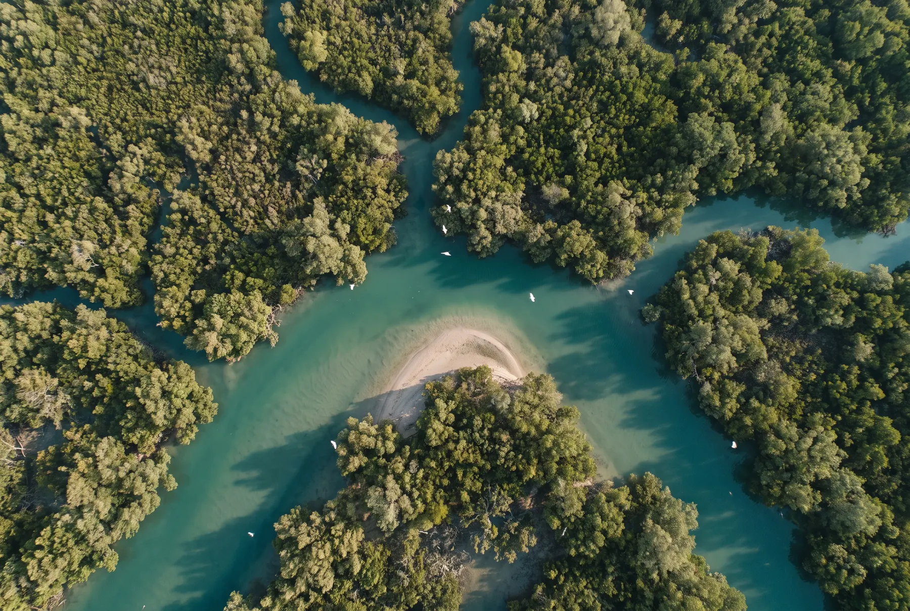
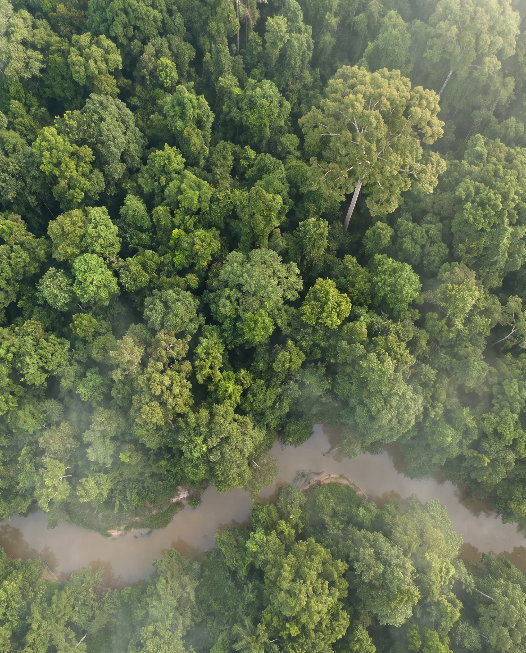
The proof behind conservation.
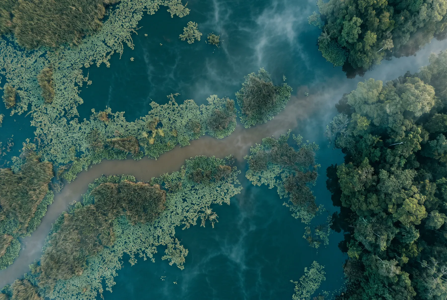
No one posing.
Drone photography, or a generated image that reads as a photograph, in morning light. No forced shapes and no stock leaves: the territory is the subject.
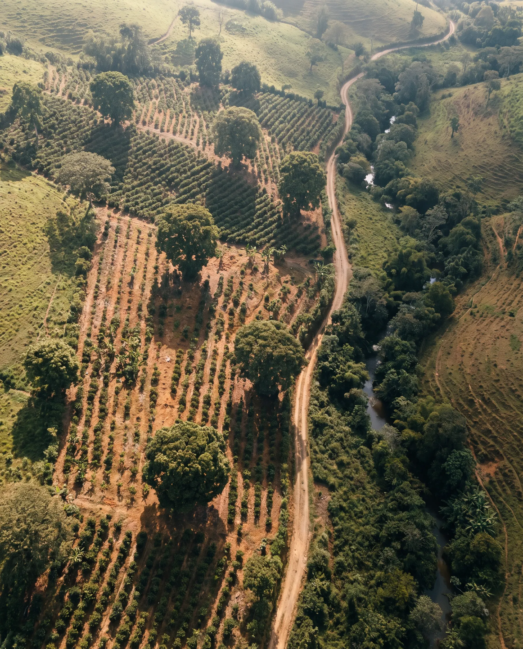
1.618
The ratio of the page and of the type. The larger block is for the image or the headline; the smaller, for the text.
From above, real.
Full bleed.
The territory fills the piece and the mark is small, in a corner.
Precise.Calm.From the field.
Karvonus writes like a forest engineer who understands the market: figures with their unit, short sentences, concrete verbs. It never promises, it shows.
The proof behind conservation.
3,215 hectares measured tree by tree.
Comprehensive solutions for a sustainable future.
Your report, ready for Verra in 30 days.
We revolutionise the carbon market with AI.
We measure what others estimate.
We are your strategic ally in the transition.
In the field.
One family per piece: waters for the brand and monitoring, earths for Seed, greens for the calculator. Never a drawn K that looks like the logo.
Closing
We are the proof behind conservation.